Showing posts with label color blending. Show all posts

Tuesday, October 16, 2012

Anne Bagby & Lynne Perrella - Clown Workshop

It was my over-the-top-LUCKY day when I learned Anne Bagby and Lynne Perrella were coming to my island (little, remote San Juan Island) to teach a 4-day workshop! Their theme was clowns... they would alternate teaching, two days each.


I've taken classes from both of them previously (at Art Fest), learning much of what I know about painting with acrylics and collage from them. I've incorporated painted, decorative papers into all of my beaded books. Above all, I owe to them the techniques of layering and glazing.

I want to write more posts about the workshop, which just finished yesterday, and show some of the teachers' and other students' work. But for today, I'm just going to show my own work.

Day 1

Anne taught some methods for drawing faces, and how to alter a picture of a face (perhaps taken from a magazine) to suggest a clown's face. We used white oil markers to make the faces white. I had two types. The whiter face was done with a Sharpie marker. Some of the other students used color pencils to shade the faces and make them look realistic. Since I've never even attempted to draw a face, I just stuck to outlines this time. But I envied the more realistic look.

Clown with Beard
Using painted 5x7 canvases, we collaged papers over the surface as a background for our "clowns." On other canvases, we simply sponged paint on the surface to give it a more complex look.

Lee and Madeline
We cut a "lump" out of painted papers from our stash (or Anne's stash) for the body, and used matte medium to attach it to the canvas.

Clown with Red Hat
Finally we added the face. To complete the pictures some students added ephemera, such as lace, buttons, etc. to make them more clown-like.

Babushka
 I chose to keep them simple, but did glaze most of them to soften the look.

Day 2

Lynne taught how to work with a toner-copy of a photograph, how to make it our own using her new favorite medium, Portfolio brand water soluble oil pastels (24-colors). She showed us how to cut stencils and masks to enable coloring in certain areas and to make lines like the shoulders on my painting below.

Alfred Tomkin
Using gel medium we attached our pastel-worked faces on 8 x 10 canvas boards, which in my case, were pre-painted. Lynne showed us how to collage papers and work with paint and/or pastel layers to integrate the faces with the background. Since my face images were face only (no neck, shoulder, or body), I had to create those parts with paint and pastels.

Lilly Tomkin
The images I used were family photos - my great grandmother, Lilly Tomkin, and great grandfather, Alfred Tomkin. I never knew them, but always loved these pictures of them. I just couldn't make them into clownish, clowns. So I just suggested the clown idea with colors and the use of the diamonds (harlequin) motif, while trying to preserve the dignified portrait look.

 Day 3

Anne taught four different methods for creating masks and stencils of figures. She also taught us how to make complex papers, which are collages of various painted papers, used then as a single sheet of painted paper. Her work using these methods is phenomenal (as you'll see in a future post), but I struggled hugely this day.

Cab Calloway
We were supposed to do four figures. I only did one. His face is one I drew on day 1... again, I wished I knew how to shade the features. One student was using water soluble pencils to shade her work, and the results were stunning.

A problem for me was that I couldn't find a way to relate, personally, to the faces and figures, to care about them, to find meaning in doing them. This one, for example, didn't have meaning for me until last evening when I showed it to my husband. He said it reminded him of the musician, Cab Calloway. OK... now I like it better.

Day 4

Lynne worked with us to pull it all together... everything we learned in the previous three days. The project was to make a vertical or horizontal panel with several faces.

Directors
What fun it was to turn a photo of my husband, our Siamese cat, and my grandmother into a painted-collaged piece! I call it "Directors," because these are three influences that in different ways direct my life journey. The night before, I re-read favorite chapters in one of my favorite books, "Improv Wisdom," by Patricia Ryan Madson. Brilliant! It really freed me to have fun, to play, to let go of "doing it right." I love the results!

More pictures from the class soon. Don't forget, you can click on Lilly and Alfred (day 2) to enlarge and see more details.

Saturday, April 17, 2010

How to Blend Bead Colors

Kali recently posted this picture of her beautiful March BJP piece, called Dancer.

Dancer, bead embroidery by Kali Tal, March BJP piece
She wrote:

The first thing I learned is that, no matter how many different colors of beads you’ve got, it’s never enough. As a painter, I’m used to mixing my own colors, and it’s a bit tougher with beads. Next time, though, I’m going to try mixing some bead soups to supplement my color palette.
Like Kali, if you're working with glass beads, you'll soon learn that there are only so many colors and those you have can't be mixed like paint. Even the Delica line, which has by far the most colors, is limited in some areas. And, for bead embroidery, Delicas are less than wonderful because of their large holes and tubular shape.

When you need a color you don't have, you might try changing the appearance of the color with the thread color. For example, if you have transparent yellow beads and you want them to appear lime, you can stitch them with green thread. This only works with transparent beads.

Here's another way to "blend colors" that works with any beads (matte, opaque, transparent). I discovered it 25 years ago when my bead thing was making multiple strand necklaces such as the one below. (Note, all the pictures in this post can be clicked-to-enlarge so you can really see the details.)

kimono necklace by Robin Atkins, blended red and black beads
Notice how this is a red and black necklace, yet in the center of the necklace the red and black blend together making a smooth transition from one color to the other. The chart below shows the basic technique for accomplishing a blend between two colors (click to enlarge).

pattern for blending bead colors by Robin Atkins
The pattern is: 5B, 1T, 4B, 1T, 3B, 1T, 2B, 1T, 1B, 2T, 1B, 3T, 1B, 4T, 1B, 5T. This variation of the pattern takes 36 beads to go from one to the other color. But it can be done with more or less. For example, the center section of the pattern only takes 14 beads (3B, 1T, 2B, 1T, 1B, 2T, 1B, 3T) to achieve the transition. While one could make a random blend, I often use a variation of this pattern.

Let's look at the red/black necklace in detail. Below is how the strands look before attaching the clasp.

kimono necklace by Robin Atkins, strands of red and black beads
And here is a detail showing just the center part where the colors are blended. By changing where the blend happens in each strand, I also achieve a vertical blend from strand to strand.

kimono necklace by Robin Atkins, center section, strands of red and black beads
Below is the red side of the necklace. Notice there are no black beads in the upper part of it. I tried, but they were such a strong contrast in value that they made the eye go right there. I wanted the eye to come to the center of the necklace and enjoy the blending of the two colors.

kimono necklace by Robin Atkins, detail, top of red side
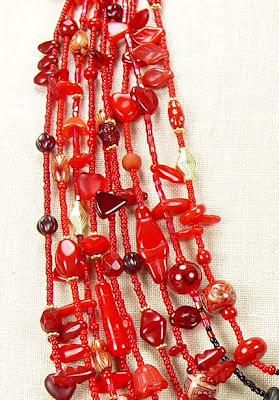
Below is the black side of the necklace. Here I have put some red beads in with the black because without them it seemed unbalanced in value, too dark.

kimono necklace by Robin Atkins, detail, top of black side
And below is a detail showing how the center of the necklace looks when worn.

kimono necklace by Robin Atkins, detail, center where black and red beads are blended
I've used this technique in many multiple strand necklaces over the years and have always liked how it looks. When I began stitching beads on cloth, I often needed colors I didn't have or that don't exist. Could I use the successful stringing blend for my bead embroidery?

beaded butterfly by Robin Atkins, bead embroidery, bead journal project
Yes! Above is my November BJP (2008-9). Wanting to bead a fairly realistic butterfly, I needed to blend the colors, especially on the edges of the wing and where the wing meets the body.

beaded butterfly by Robin Atkins, detail, bead embroidery, bead journal project
By using backstitch and changing bead colors in a similar way to the chart above, I was able get the look I wanted. When you backstitch several lines of beads next to each other that all have color changes in them, you can create a beautiful blended look. I also blended colors in the short stacks that make the body of the butterfly.

bead embroidery, landscape, by Robin Atkins, waterfall and skunk cabbage
For my April BJP (2008-9), I used this method to blend colors in the waterfall and flowing creek water.

bead embroidery, landscape, by Robin Atkins, waterfall detail
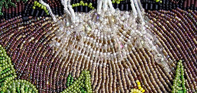
Above is a closer look at the water. It's actually only 3 colors (white, clear and smokey topaz). I used a dark brown thread color where I wanted it darker and white thread for the lighter areas. Plus I blended the colors in each line of beads, similar to the pattern shown on the chart above.

bead embroidery, landscape, by Robin Atkins, skunk cabbage detail
For the skunk cabbage, I used a different method for blending. Again using backstitch, I stitched a line of beads in one color, a different color next to that, and a third color in the ditch, on top of the other two lines. This gave both texture and a subtle shift in color to stems, leaves and flower. I've marked the places where I used this method with white arrows.

bead embroidery, landscape, by Robin Atkins, skunk cabbage detail
Below is a detail picture showing one of the other skunk cabbages.

bead embroidery, landscape, by Robin Atkins, skunk cabbage detail
I've probably only scratched the surface of what is possible in the color blending department. If some of you have found other ways, I'd love to read about it on your blog!

FYI

I designed the red/black necklace based on colors in a Japanese kimono as a project for Margie Deeb's book, The Beader's Color Palette. See pages 91-93 for step-by-step instructions how to make it. Also, if anybody is interested, I might be willing to sell Kimono Necklace.

I also designed several other pieces for Margie's book as projects or to illustrate specific color palettes. Two of them also involve color blending: pages 55 and 163.

If you don't have this book and have any interest in expanding your color comfort zone, Margie's book is a must have... at least check it out from your local library!