She wrote:
The first thing I learned is that, no matter how many different colors of beads you’ve got, it’s never enough. As a painter, I’m used to mixing my own colors, and it’s a bit tougher with beads. Next time, though, I’m going to try mixing some bead soups to supplement my color palette.Like Kali, if you're working with glass beads, you'll soon learn that there are only so many colors and those you have can't be mixed like paint. Even the Delica line, which has by far the most colors, is limited in some areas. And, for bead embroidery, Delicas are less than wonderful because of their large holes and tubular shape.
When you need a color you don't have, you might try changing the appearance of the color with the thread color. For example, if you have transparent yellow beads and you want them to appear lime, you can stitch them with green thread. This only works with transparent beads.
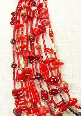
Here's another way to "blend colors" that works with any beads (matte, opaque, transparent). I discovered it 25 years ago when my bead thing was making multiple strand necklaces such as the one below. (Note, all the pictures in this post can be clicked-to-enlarge so you can really see the details.)

Notice how this is a red and black necklace, yet in the center of the necklace the red and black blend together making a smooth transition from one color to the other. The chart below shows the basic technique for accomplishing a blend between two colors (click to enlarge).

The pattern is: 5B, 1T, 4B, 1T, 3B, 1T, 2B, 1T, 1B, 2T, 1B, 3T, 1B, 4T, 1B, 5T. This variation of the pattern takes 36 beads to go from one to the other color. But it can be done with more or less. For example, the center section of the pattern only takes 14 beads (3B, 1T, 2B, 1T, 1B, 2T, 1B, 3T) to achieve the transition. While one could make a random blend, I often use a variation of this pattern.
Let's look at the red/black necklace in detail. Below is how the strands look before attaching the clasp.

And here is a detail showing just the center part where the colors are blended. By changing where the blend happens in each strand, I also achieve a vertical blend from strand to strand.

Below is the red side of the necklace. Notice there are no black beads in the upper part of it. I tried, but they were such a strong contrast in value that they made the eye go right there. I wanted the eye to come to the center of the necklace and enjoy the blending of the two colors.

Below is the black side of the necklace. Here I have put some red beads in with the black because without them it seemed unbalanced in value, too dark.

And below is a detail showing how the center of the necklace looks when worn.

I've used this technique in many multiple strand necklaces over the years and have always liked how it looks. When I began stitching beads on cloth, I often needed colors I didn't have or that don't exist. Could I use the successful stringing blend for my bead embroidery?

Yes! Above is my November BJP (2008-9). Wanting to bead a fairly realistic butterfly, I needed to blend the colors, especially on the edges of the wing and where the wing meets the body.

By using backstitch and changing bead colors in a similar way to the chart above, I was able get the look I wanted. When you backstitch several lines of beads next to each other that all have color changes in them, you can create a beautiful blended look. I also blended colors in the short stacks that make the body of the butterfly.

For my April BJP (2008-9), I used this method to blend colors in the waterfall and flowing creek water.

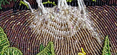
Above is a closer look at the water. It's actually only 3 colors (white, clear and smokey topaz). I used a dark brown thread color where I wanted it darker and white thread for the lighter areas. Plus I blended the colors in each line of beads, similar to the pattern shown on the chart above.

For the skunk cabbage, I used a different method for blending. Again using backstitch, I stitched a line of beads in one color, a different color next to that, and a third color in the ditch, on top of the other two lines. This gave both texture and a subtle shift in color to stems, leaves and flower. I've marked the places where I used this method with white arrows.

Below is a detail picture showing one of the other skunk cabbages.

I've probably only scratched the surface of what is possible in the color blending department. If some of you have found other ways, I'd love to read about it on your blog!
FYI
I designed the red/black necklace based on colors in a Japanese kimono as a project for Margie Deeb's book, The Beader's Color Palette. See pages 91-93 for step-by-step instructions how to make it. Also, if anybody is interested, I might be willing to sell Kimono Necklace.
I also designed several other pieces for Margie's book as projects or to illustrate specific color palettes. Two of them also involve color blending: pages 55 and 163.
If you don't have this book and have any interest in expanding your color comfort zone, Margie's book is a must have... at least check it out from your local library!


Thanks so much for this post as this is something I have been experimenting with...sometimes successful and sometimes disastrous.... It never occurred to me that the thread color could make that much difference....I will definitely get that book....
ReplyDeleteGerry K.
You know Robin, after reading this post I thought, what the heck. Its just common sense, so why can't I achieve this technique! I'm working on it.
ReplyDeleteThanks so much for this lesson. Its so much appreciated.
BTW, glad you are back.
XX, Carol
reading this post has been very helpful for me. i have been toying with the idea of trying some blending in something new, but my floating ideas haven't become anything concrete yet. this post helps me with the "how to"...i'll be referring back to it quite a bit, i'm sure!
ReplyDeleteGreat post, Robin. I have two of Margie's books and used them as a basis for a class on color I gave for our Bead Society in February. I love the idea of painting with beads. I used color blending on my "Fire" page last year.
ReplyDeleteOh my gosh, NOW I understand why so much of your work feels so 3-D to me. My eye saw what you've just explained but my brain hadn't connected the dots yet -- or should I say, hadn't connected the beads yet!
ReplyDeleteThank you for posting this very informative tutorial, Robin! I have never utilized this technique (on purpose anyway) but I can definitely see the value of learning it & am anxious to give it a try. Earlier, I too, thought Delicas would be my answer -- not!
Off to check out Margie's books... HAPPY SPRING!!
Thank you so very much for this posting. Great explanation and corresponding examples. Blending seems like one of those elusive things that we don't think about until we finish a piece and then wonder why it doesn't appear the way we've imagined. You've explained it so perfectly, now I just have to take your words and practice - or should I say practice, practice, practice.
ReplyDeleteThat was fascinating. I love experimenting with colour and this was quite fascinating. I have had Margie's book for a few years now and think it is the best of its kind that I have seen, so I would heartily recommend it to anyone reading these comments. Thanks for sharing mo
ReplyDeleteThank you!!! Such great info, tips and just all around bead color theory! Thanks so much!
ReplyDeleteso ingenious! reminds me of Pointillism painting, only with beads. So lovely...
ReplyDeleteThanks Robin! This was very useful. I'd already tried varying the thread color with transparent beads, and I knew I had to try mixing bead colors to get gradual shifts next time, so it's incredibly helpful to have a recipe for mixing and a lot of good examples. I've been thinking about the "pixelated" nature of bead embroidery (and beading in general) and your post makes it even clearer that I have the same problems with my beading that I have with creating small pixelated icons in my multimedia artwork.
ReplyDeleteWhat a fabulous post !! thank you so very much for the much needed lesson!!!! Hugs!
ReplyDeleteElizabeth
Thank you for this great post, Robin. Shading can be intuitive sometimes, but other times you really need some guidelines. Thanks for providing them! I've only really done monochromatic blending by using different finished on what is basically the same color bead. But, I'm often amazed at the results you can get from using the different finished.
ReplyDeleteMaryanne
To all ~ Thanks your comments. I'm so glad that you found this post useful!
ReplyDeleteTo those who mentioned pointelism ~ Yes, it's a lot like that. A study of pointelism could add a lot to our bead embroidery possibilities!
To Sheep Rustler ~ you might want to check Margie's website to see that you have her most recent book on color. Her first was pretty good. But this most recent book is absolutely FABULOUS!
Thanks again! Robin A.
I agree - one can never have too many colours of seed beads!
ReplyDeleteThis is one of the greatest quests for me now. One thing is to master stitches but absolutely different thing is to master colors. I am struggling with this for almost a year and still can’t see the end. Great post! (Ieva / Gutta)
ReplyDeleteJust speechless here with your patience and your skill!!
ReplyDeleteThis was a great lesson with lots of yummy yummy and well-illustrated examples.
ReplyDeleteYour diagram of bead changes/transition looks exactly like the ones in my notes for making color changes in silk shading embroidery. We actually have the same problem with softening the transition from one color of thread to another and use this technique very successfully for that as well.
Have a beadiful day, Robin. xo Susan
Very, very clever. Impressive indeed. Thank you for sharing this wealth of fascinating information and insight.
ReplyDeleteBetween deadlines and house stuff, I somehow missed this really wonderful post -- but glad to have caught up with it! The very best book I ever found on how to blend and manage color for beading is not a beading book at all, or even an art book, it is a book called Butterfly by Jean-Pierre Vesco & Paul Starosta. It is a beautiful book of photographs of living butterflies with intense closeups. A butterfly's wing colors are made up of little scales of individual colors -- just like beads, really. I have two copies, and refer to them constantly for inspiration and instruction. I also suggest, speaking of pointalism, looking at the works of George Seurat. He never blended color, but worked with tiny dots of color (worked out mathematically -- what a guy!), knowing that our eyes/brains will blend the colors as we see them. The other really important lesson I learned (from my dad) about colors is that, in nature, nothing is one single color, but made up of many different shades and hues. A tree trunk, for example, isn't just one brown color, but many different browns, greens, beiges, even sometimes bits of blues and reds appear there. Your work really comes alive because you use different greens in a leaf, different yellows in a flower. Thanks so much for sharing all this technique and inspiration!
ReplyDeleteAmazing work! A real inspiration to me; and countless others as well judging by your followers and lovely comments.
ReplyDeleteI'm just at the beginning of my beading journey...but am head over heels in love with beads!
Kathy
www.shawkl.com
www.shawkldesigns.com
Hi there,
ReplyDeleteI'm new to beading, and mostly doing circular rosettes for the time being. Do you have any suggestions on using that color transition pattern in a circular piece? Thanks!
Your tips is an awesome inspiration! Many thanks for sharing. I would like to feature it http://www.handmade-jewelry-club.com/
ReplyDeleteContact me here if you have a concern.
Jane
http://diylessons.org/
Thank you so much for this post! I am a beginning bead embroiderer and find all your tips and techniques amazing. I can't wait to start using them. Thanks again!
ReplyDeleteThanks for this post you have inspired me to start working with seed beads.
ReplyDelete