Monday, January 15, 2018
"Eclipse" - Scrappy Improvisational Quilt
Basically, what we did was to empty our bags or boxes of scraps onto a large table and start pawing through them, pulling out ones that appealed to us at that moment. For me it was all about color - red, magenta, fuchsia, with hints of pink, golden-yellow, orange, lavender, and dark green. All of the fabrics were in my scrap box. We had two days of Thom's demonstrations and guidance. During that time, each of us in our small group produced a unique and very pleasing "piece" or "block," measuring roughly 18 x 21 inches, the size of a fat quarter.
One of my red scraps, cut in a nice arc at one end, was the start of it all because I liked the shape and the color. Next I picked up a small strip of yellow, and held it behind the arc of red. Ooooh! Nice enough to repeat. The scrap of orange/red batik was large enough to cut a similar arc, and the strip of yellow was long enough to go behind that one too. These two arcs formed the basis of my piece.
You can see the two arcs above; the lower right was the first. The yellow strip was only about 3" wide, not enough to go all the way around the arcs, but I cut two shapes that would echo the top of each of the arcs. I layered the remaining scraps from that on top of the arcs along the vertical edges of the design. Then I put a dark green scrap behind the arcs and the yellow, which set them off nicely. The rest was just filling to the edges of the quilt with more scraps, including fussy-cut leaves and flowers.
The next step was to glue it all together along the 1/4" seam overlap, working in layers from bottom to top, and cutting away the excess fabric from the underside after each piece is glued. Cutting away the excess fabric leaves a double layer of fabric only at the seams; the rest is a single layer. The glue is Elmer's School Glue, Disappearing Purple, as shown below. It is an organic stick glue, relatively easy to sew through, repositionable, (in case you change your mind), and purple when first applied, drying to transparent (so you can see where exactly you are putting it).
Thom's method is a type of raw edge applique, typically accomplished with heat-fusible web, such as "wonder under." The typical method, given a complex, layered design such as mine, would have resulted in a thick, stiff, multi-layer surface, which would be difficult to quilt, even with a machine. In Thom's method, there is no web, and in most places only one or two layers of fabric. Like all raw edge techniques, the raw edges must be sewn down, and the resulting quilts are not very suitable for bed quilts unless there is heavy stitching over the raw edges (for example, dense, zig-zag, machine stitching).
After gluing my original (shown above) quilt top, I assembled the quilt, using a spray glue to layer the backing, batting and top. The next step was to stitch along the "seams," the overlapping, glued edge of each piece. From there, it was up to each of us as to how to finish the quilt, perhaps with machine quilting, such as stippling or contour stitches, or perhaps with beading, all of which Thom does on his quilts.
A couple of months went by after getting to the unfinished stage shown above. I liked it, but didn't know what to do with it, until one day when I was at our Senior Center, getting foot care from a trained nurse who comes a couple times a week to help those who need it. Her treatment room, about the size of a walk-in closet, has no windows. Her client faces the door to the room, a plain, wooden door. "That door needs a quilt," I told her. The rest is history; my scrappy improv quilt, Eclipse, hangs there now.
Only first I had to finish it. Above is the finished quilt, Eclipse. Below I'll tell you some of the finishing steps and about how I transformed it from looking flat and ordinary to sharp and textured using embroidery embellishments. Please click on the photo so you can see the details!
You might have noticed that the finished quilt is longer (better suited for hanging on a door) than the original piece. That was a challenge, although less than you might expect, because Thom had demonstrated for us how he sometimes extends the size of his quilts. In short, I roughly planned out the addition, the mock-up shown below, then created it using the same process and scraps as the original piece.
I used fusible "tape" made for butt-joining pieces of batting, to add a new piece of batting to the bottom edge of batting on the original (upper) part of the quilt. The horizontal strip of striped fabric overlaps the two parts of the quilt and the joined batting underneath. As you can see below, I added a fussy-cut flower over the striped fabric to break up the horizontal strip and visually join the two parts.
Confession time... I'm not good at machine quilting, and don't even have a proper quilting foot for my old machine (1972 Pfaff). I tried stitching around the fussy cut flowers to secure the glued edges, but failed miserably. What to do? Ah, hand-sew with embroidery stitches and floss? Yes! It took a few tries, but eventually I found stitch and thread combinations that worked.
It looked so good that I decided to add stitching and knots to the yellow arcs next. Wow! That popped the eclipse look! In the photo below, you can see bits of all the embroidery stitches I added. Not only does the embroidery provide embellishment and emphasis, it also further quilts the piece. Click the photo to see the detail and better read the stitch identification.
Here are two more detail photos of the finished quilt (without the text boxes).
Lots of fun, and I like the results! Will I do another one? Well, right now I've finally returned to my hexie project, where I'm likely to remain for many months, but after that, scrappy improv may be just what I need!
Wednesday, December 30, 2015
How to Frame Bead Embroidery
During the past 28 years of stitching beads on cloth, I've veered away from making necklaces, bracelets, and bags or purses, mostly producing wall art pieces. Thus, I've had lots of opportunities to experiment with various methods of finishing and framing my work, making it suitable for display.
I always leave ample fabric margins surrounding the actual beaded area, giving me lots of options for finishing or framing. One simple finishing method is to wrap the extra fabric around the sides of a manufactured painting-canvas (over stretcher-bars), and lace the fabric snugly across the back, as in the photo below.
But the problem with this method, of course, is that the surface of the beading is exposed to dust and air-borne grime, which over the years may spoil the fresh look of the beading, aging the piece prematurely. So we look to frames and glass to protect our work.
Among the various methods for covering (and protecting) beadwork with glass, the following is the one I use most frequently, and like the best. It's not very expensive, or particularly difficult, although it does take a bit of time. Even if you already know about frames, please take a look at the section called Preparing Your Bead Embroidery for Framing in the Tutorial below.
Tutorial: How to Frame bead Embroidery
Choosing a Frame
Glass: I believe in using the highest quality glass, even though it is a lot more expensive than ordinary glass. The UV resistance is good, but the primary reason for using premium glass is its clarity, which allows the viewer to see the details of your work without any distortions or color shift, as if there were no glass at all. Note: do not use non-glare glass. It only works if it lies directly on the surface of the art. You will be putting risers under the glass so it sits above the uneven surface of your bead embroidery, not touching any of the beads; even at this slight distance from the beadwork, non-glare glass will look frosted and obscure the details of your work.
Other Framing Materials You Will Need
Risers: Dense plastic rods, risers are 1/8th inch square in cross-section, with an adhesive surface on one side. Use a wire nipper to cut the rods to fit along the outer edge of the glass; remove the paper strips covering the adhesive from the the risers, adhering them to the glass along the edges, as shown above. They prevent the glass from touching your beadwork, by resting on the outer edge of the mat, thus holding the glass above the beaded surface. If the surface height of your beadwork is greater, you can adhere two rods together, making a quarter-inch of space. If the depth is more than a quarter-inch, you might want to consider mounting your work in a shadowbox frame (see this post for a good example and instructions).
Preparing Your Bead Embroidery for Framing
Tip: I like to rest the beaded side face down on a thick, folded, bath towel while I am lacing the back.
Assembling a Bead Embroidery Sandwich
Now it's time to make a sandwich with the foam core board between two pieces of acid-free mat board, one which has a beveled hole cut in the center, the other which is solid and goes on the back.
Tip: One way to get an exact measurement of the beaded area is to make a 100% copy of it on a scanner or copy machine. Cut out the copy with a ruler and mat knife, test it by holding it over your beadwork. If it is exact, use it as a template to mark the hole on the mat board. If the mat is hand-cut, the hole does not have to be precisely square or rectangular.
Assemble the Frame
Tip: Whether using a metal or wooden frame, the depth of the frame is an important consideration because the d-d-sandwich will be thicker than a photograph or most paintings. The measurement of the depth, or space inside the frame structure to accommodate the thickness of the artwork, is called the rabbet. The rabbet measurement on the above metal frame is 9/16th of an inch, which is adequate with a single riser under the glass. But it's a tight fit, the springs having to be nearly flat when inserted. If I had used a double riser, I would need a frame with a deeper rabbet. I've found it rather difficult to find small, narrow, simple, plain, wooden frames with a deep enough rabbet.
Here is a link for downloading this post as a printable PDF. It's a free, and slightly expanded version of what you've seen above. Free Download: How to Frame Bead Embroidery by Robin Atkins
Thursday, October 08, 2015
Tips for Cutting Fabrics for a Hexie Quilt
The first thing I do, is sort my scraps into piles by size. The easiest to work with are strips. These I iron, sort by approximate width, and stack 6 strips high, aligning the top and right side edges. Then I cut each stack of 6 strips to exactly 2" wide by slightly more than 14" long. From each one of the strips, I will get one set of petals and one center. After cutting 5 stacks of strips (a total of 30 different fabrics), line them up next to each other as shown above, and cross-cut 2" squares through all of the strip piles at once.
Now, pick up the piles of 2" squares, and place them in stacks, alternating the orientation as shown above.
Next, use dressmaker's shears to trim the corners off of each of the piles. Each pile has 6 fabrics, so you are trimming 6 at a time. Re-stack them as shown above. Note that there are only 6 piles in each row. The 7th pile in each stack, I have set aside to use for centers. These I keep separate from the petal sets, selecting a center for each petal set later in the flower-making process.
The final step is to separate each of the piles into 6 separate piles, one for each of the fabrics. You will end up with 30 singles piles, or petal sets, each with 6 of the same cut and corner-trimmed fabric, enough to make 30 hexie flowers.
Certainly there are other, and even possibly more efficient ways to cut fabrics for hexies, but this way works well for me. Some quilters recommend using the squares without trimming the corners. I tried it that way, but went back to corner-trimming because I like not having the extra bulk toward the centers of each hexie. I'm especially glad I trimmed the corners on my Grandmother's Flower Garden hexie quilt, because it was that much less to stitch through in the hand-quilting process.
Sometimes, the fabric scraps are not strips, or would more effectively be cut as a chunk rather than strip. Basically it's the same process. I stack 6 different fabrics, aligning the top and right hand edges. From this stack, I cut a 4 x 6 inch block, and then cut that in half to make two 2 x 6 inch strips. I align the strips the same way as the 14" strips above, cross-cutting several at one time, and finish the same way as described above.
Fabric Cutting Guide for Different Sizes of Hexies
1/4" hexie --- cut 1" squares1/2" hexie --- cut 1-1/2" squares
3/4" hexie --- cut 2" squares
1" hexie ------ cut 2-1/2" squares
1-1/4" hexie - cut 3" squares
1-1/2" hexie - cut 3-1/2" squares
2" hexie ------ cut 4-1/2" squares
3" hexie ------ cut 6-1/2" squares
4" hexie ------ cut 8-1/2" squares
6" hexie ------ cut 12-1/2" squares
A very handy, and more complete cutting guide is available from Paper Pieces, which is where I get my pieces. Nope, I don't cut my own; too boring, and I really like the precision of die-cut paper pieces!
For a lot more helpful tips on making a hexie quilt, please see these posts:
Grandma's Flower Garden - 3/4 Inch Hexie Quilt - Time StudyHand Quilting a Hexie Quilt
Hexie Quilt - Embroidery Quilting in Flower Centers
Hexie Quilt - Paper Pieces are GONE + Tips
Hexie Quilt - To Fix or Not to Fix
Hexie Quilt Top - Almost Finished
Hexies Galore - Grandma's Flower Garden
Grandma's Flower Garden Quilt - I'm Doin' It!
Saturday, February 01, 2014
Bead Embroidery - How to Bead a Circle
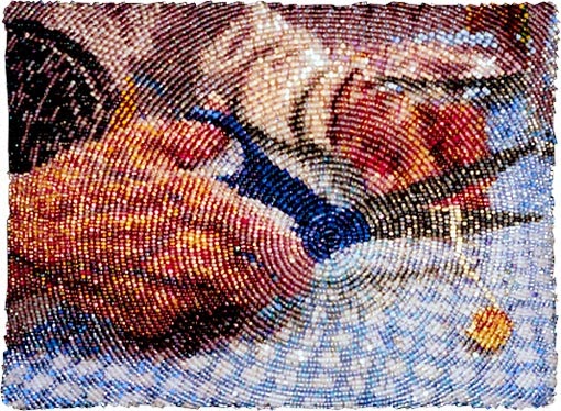
The master at this technique is Amy Clarke Moore, former editor of Spin Off magazine and co-author with me of Beaded Embellishment. Here is one of her pieces.
At the time we were writing Beaded Embellishment, I was too busy doing my own style of bead embroidery with lots of surface texture to try Amy's technique. But I admire it greatly. In our book, she explains how she manipulates a photo (or drawing), prints it on paper, puts the paper on top of fabric, and beads directly onto the paper, following the shapes and colors of the print with her beads. She suggests starting the circle somewhere in a highlighted area, a place where she wants the viewer's attention to go. Then she builds circle after circle, selecting uniformly shaped beads (all size 15) in a color and finish that compliment the picture she is beading. Watching her work several times, I marveled at how many different size 15 beads she has and how carefully she selects each bead, especially mindful of the finish of the bead (shiny, matte, opaque, transparent, color lined) and the affect it will have on her "bead painting."
Here's a link to Amy's blog post where she tells how to get started, to make the design for an ornament such as "Little Star" shown below.
If I were going to make an entire bead painting using her method, I would probably try printing the picture on fabric, and beading as usual on the printed fabric with paper on the back as a stabilizer. Truth be known, I've always thought I might get bored beading a pre-printed picture, so I've never tried the technique on a full-sized piece.
However, it is a useful method for making beaded circles, and in my most recent piece, I more-or-less used Amy's method, following the sun-dyed print on the fabric to make the background world to my message. Here is the piece:
The title is "Message to Citizens of the World", and you can find out more about the meaning of it here. Basically it takes a look at voluntary population control as a means to save the earth and our species. Notice the background? It represents the world. It needed to be concentric circles. Here's how I did it.
First, I chose a point to be the center. Turning to the paper backing on my beadwork, and using a compass, I placed the anchor at my chosen center point, and drew concentric circles outward, spaced about 3/8 inches apart. Next, using a fine sewing thread in a color that shows up well on the front (fabric side), I basted a line of stitches along each circle. These stitches, visible on the front are my guide, the marks that help me keep the circle round. In the picture above, I've already started beading the circle, but you can see the pencil marks and stitches in the unbeaded areas.
Here's how it looks on the right side:
In this case, the circle started as a spiral. But next time, I'll begin with a single bead at the center point, and then start making rounds of circles around that single bead.
I use only back stitch and size 15 beads. When the circles are small (the first 2 - 4 rings out from the center), I stitch 4 beads at a time, back stitching through the last 2 beads. After the circle gets larger, I stitch 5 beads at a time, back stitching through the last 2.
Tips
- When I get to an isolated area, as shown above, I bead along the stitched guide line first, then smooth the line by sewing back through the whole line of beads a couple of times. From there, I bead inward to meet the rough edges of the figure as closely as possible. This method keeps the circle round and the visual lines connected.
- When the outside edge of the circle is not visible on the piece, it works best to start in the center and work outward. When the outside edge is visible, it is sometimes better to start at the outside edge and work inward (see below).
- Every 4 or 5 rounds, I stitch back through the entire round of beads to smooth it out.
- Although I try to select against beads that are a little larger, fatter, smaller, or skinnier than average, or beads that have an irregular shape, I'm not very patient. Therefore, when you click to enlarge the picture, you can see a few gaps and/or larger beads. On the actual piece, which is only 2.5 inches wide, I don't notice these irregularities (thankfully).
- This method will work with larger beads, size 11, and possibly size 10. But the detail will not be as great unless the finished piece is fairly large.
- Sometimes a line of beads will seem a bit crowded, some of the beads popping up a bit, or slipping under other beads. When this happens, if it bothers me, I take out the lines of beads back to the problem, and re-stitch the line allowing more space for the beads. I've tried going back to couch down the beads which are popping up. Unfortunately, forcing beads down on the surface in one area, generally makes other beads pop up somewhere else. So my rule of thumb is to always be vigilant about not crowding the beads, allowing a little of the under fabric to show in places, allowing the sewing thread to show a bit. Nobody ever notices it when the piece is finished.
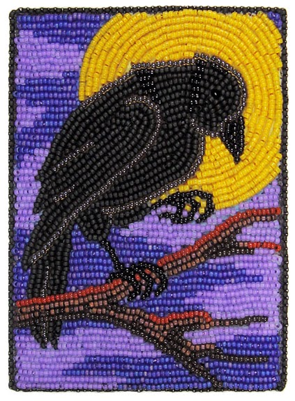
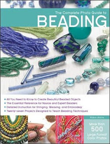
Here is a picture from my recently published book, The Complete Photo Guide to Beading. "Raven Moon" is one of the projects in the book (pages 188-191). In this case, I beaded the moon after finishing the raven, in order to make it appear that the raven is in front of the moon. Because I wanted the outside edge of the moon to be a sharp and accurate circle, I beaded the moon from the outside inward. Working in back stitch, trying to weed out oddly shaped beads, I first beaded the outside ring of beads in the places where it is visible. I stitched back through these beads several times, until the circle was smooth. Then I worked inward, ring by ring until the lines met and the moon was complete. If the inside rings aren't quite round, or don't quite match up from section to section, it doesn't matter, because the viewer's eye will always perceive the round shape as defined by the outside ring of beads.
Wednesday, May 01, 2013
In The Pink ~ Wireworking Tutorial
Either way, as I put on my pink corduroy shirt this morning, the thought of making some new pink earrings propelled me into the studio. Yay... ignore the boxes and have some beady fun! As long as I was doing it, why not take a few pictures? OK, so here's a mini-tutorial about wire working.
This is how they look finished.
You need half/hard or full/hard wire for these, because they need to have some "spring" to them in order to be able to fasten the hook at the back. I used 20 ga., half/hard, gold-filled wire for this pair.
Cut two pieces of wire, each 4.5 inches long. File one end of each wire, so that the cut end is smooth. Use a small, round-nose pliers to make a small loop at the filed end of each wire.
Load the beads on the wire. Disc-shaped, lampwork beads work well for this style of earrings. I add a gold-plated snowflake spacer bead and a 2mm gold-filled, round bead on each side of the disc. After adding the beads, bend the wire upward at a 90 degree angle as shown in the picture. If the loop is turning the wrong way, grasp it in the jaws of a flat-nose pliers and twist to position it correctly (horizontal).
Use a felt-tip marker to make a mark on the wire 1.5 inches above the right angle bend. This mark will be at the center of the top of the earring.
Place a 3/8" or 1/4" dowel as a mandrel under the wire, centering the mark on the dowel. Bend the end of the wire downward, over the dowel, toward the loop at the back of the earring. Do this step slowly, checking your progress and making sure the bend is directly above the beads.
Cut the end of the wire about 1/8 inch below loop. File the cut end smooth, and slightly round the edges. Then I sand the tip of the wire with #400 (or finer) sandpaper, and polish it with a soft cloth to make it totally smooth.
Use round-nose pliers to round the tip upward a little, allowing it to hook into the loop for security.
These earrings are very comfortable to wear. Because of the hook at the back, you'll never cry over one lost earring!
Thursday, March 15, 2012
Books - Write! Publish? Self-Publish? Rewards! - Part 5
![]() |
| Finished manuscript! Ready to ship to publisher! |
![]() |
| This is my lighting system, although I still like overcast, natural light best. |
Design Skills Helpful
![]() |
| Prototypes (or mockups) of my books, ink-jet printer, for final proofing. |
Wishing you a lovely journey….
Friday, January 21, 2011
What Goes With This? The Personality Factor!
The most common question
I'm asked when teaching is,
"What goes with this?"
or
"Which of these beads goes better
with this fabric?"
Don't we all want to know what goes with what? Yep, I think we do. So sit back and play with some fabrics with me. Be prepared, it's a long post (with a lot of pictures), hopefully worth your time!
This is a God's Eye quilt made by Kitty Sorgen. Using many little scraps and left over strips of fabric, it carries wonderful memories and invites a warm cuddle. Kitty says the idea comes from the Huichol people of Mexico, who wind yarn around crossed sticks making ornaments which they believe will protect their children. (Here's great a blog post about making beaded, yarn God's Eye ornaments.) Below is a detail of a few of the blocks in Kitty's quilt.

What I love most about Kitty's quilts is the way she puts a little of this with a little of that in such a pleasing way. So, when she offered to teach her God's Eye quilt to our Guild, I instantly registered for the class, not because the technique is difficult (it isn't), but because I wanted to learn everything I could from Kitty about what goes with what! Some of what follows are lessons I learned from Kitty; some are principles I've known for a long time; some are ideas which came to me while making 100 blocks (enough for two large lap quilts) in the past three weeks.
Let's look at a few of these blocks...


Do you see how each block is a little mini-quilt all by itself? We can look at each one and ask two fundamental questions of design: "What gives it unity and what gives it interest?"
Unity. How do we achieve unity and/or harmony when putting different fabrics together? The surest way is to keep certain things constant. For example:
-type of fabric (ie. all batiks, all quilting cottons, etc.)
-color (ie. single or analogous color schemes)
-scale of patterns printed on fabrics
-subject or theme of patterns printed on fabrics
-value (lightness/darkness as measured on a greyscale)
-one consistent element (ie. black center in each block)
Variety. How do we achieve interest, variety or sparkle when putting different fabrics together? It's easy because there are so many different types, colors, patterns and styles of fabric. One could even put a block together that's basically all the same color, yet achieve interest by changing the scale of the prints. Below is a mostly red block, the varioius scales providing ample variety to make it interesting.

Balance. The important point when combining fabrics is this: There must be a pleasing balance between variety and unity. Too much unity and the work will be boring. Too much variety and it will seem chaotic and unsettling.
To play with and learn more about this concept, look at a few of your older works of art, ones you haven't looked at for a while (quilts, jewelry, bead journal projects... whatever). Ask yourself, "What gives this variety? What gives it unity? Am I bored looking at it? Does it make me feel uneasy? Is there a pleasing balance between unity and variety?" Honest answers help us fine-tune our sense of balance for future projects.
Back to God's Eye quilt blocks, the most fun aspect of balance is considering the personality of the fabrics. Think about it! Some fabrics are gentle and sweet, some are bold, some ultra-modern, some very old-fashioned, some sing along harmoniously, some are a bit off-key.
We could conceivably put very different colors and scales of prints together and still have balance if all the fabrics have similar personalities. Below is a good example.

All four fabrics are "forest girls," reminding us of things natural and organic... earth, water and plants. Although one fabric is a batik, one a woven stripe, one a plain tone-on-tone and one a quilting print, together they tell a nice little story, united by their common personality traits.
For me, the personality factor overrides all other considerations to the point where I use it almost exclusively in answering the question, "What goes with what?"
For my God's Eye blocks, I think of each fabric as a girl living in a college dormitory. Most importantly, she must get along with the other girls in her room, while also sharing slight commonality with all the other girls in the dorm. If the girls in one room are too much the same, they won't learn and grow from or be stimulated by each other. If they have nothing in common, they'll have problems getting along together.
Below, for example, are the beginnings of 7 blocks. I've selected one girl for each room and a roommate to go with her. I've sewn two sides and am beginning to see how well they get along together (click to enlarge if you like).
Here they are again, now with three sides sewn and a clearer idea of their developing friendships.
I like to think about their field of study. For example, at the top left, we have a philosophy major and a math major, both interested in solving problems. Just below (second from left in the second row) we have a boisterous theatre major rooming with a shy gal who studies geology. As opposites, they might be good influences on one another, but they may need a bridge, someone with interests in both their fields, to join them.
When all four sides are sewn, it's time to audition fabric strips for the third roommate! I pre-cut strips from my stash, using scrap fabrics from my bead journal project pieces from the past three years, most of the quilts I've made, several dance costumes made long ago and fabrics I've bought for spirit dolls, heart pins and other beading projects over the years. Here's a stack of strips.
And here's how they look spread out on the table ready to be auditioned.

Above you can see the first two of our gals have narrowed the field to four possibilities for their new roommate. They like the calming influence of Ms Earth Sciences (green) and Ms Horticulture (brown batik). Ms Math major has interests in common with Ms. Computer Programing (grey with red grid), but is concerned that she'll study into the wee hours of the night. Both think Ms. Art is fun, but worry that she might be too messy in the long run. Which do they choose?
As you can see above, they chose Ms Horticulture! And now the three of them are auditioning for their fourth and final roommate. Clockwise, from the top, we have Ms Botany, Ms. Environmental Studies, Ms. Entomology and Ms. Asian Studies. Right away, they realize they don't have enough in common with either the right or left possibilities and the choice is narrowed. Although either the top or bottom choice would probably be satisfactory, they pick Ms. Entomology because she has lots of energy, yet is fairly quiet. Below you can see how they look together.
Kitty likes to talk about the group as a choir, asking if there is a soloist, a duet or if we have a chorus of many voices singing in harmony. Take a look at this next set of auditions and see what choir situation comes to mind.


Another way to look at personalities is to think about conversations at a dinner table. One person (the first strips around the black center) talks to the second ring of strips; then a third ring joins them. How does the conversation change? Is one dominating the conversation? Is the conversation interesting? What do they need from the new (fourth ring) participant, a calming influence perhaps, a little sparkle of humor, a brighter point of view? Let's look at another set of auditions below with personality choices based on imagined conversations between the fabrics.
What conversations are happening above? What does each fabric choice contribute to the already flowing conversation between the first two fabrics? I chose the wide stripes because a little orderly reasoning seemed to compliment the more light-hearted chatting between the first two fabrics and the multi-colors complimented the floral fabric.
Below are the audition strips for the next fabric followed by the four possibilities I thought might join well in the conversation.

What happens with each of the four possibilities for the final conversationalist in the group? How does the conversation change depending on which is selected? Below you can see which one I thought would fit best into the already lively conversation. She's a good listener, don't you think?
Just for fun, I'll show you a couple of other auditions. You can look at them as conversations, roommates, a choir or in any way that identifies the personality of each fabric. Try to pick the one you think will work best and then scroll down to see if your choice matches mine.


And, two more....


Sometimes the auditioning goes very easily, intuition providing an instant decision, a choice that instinctively feels right. At other times, the process is very sticky, nothing seeming to fit. Below is a choice like that.
The first row of strips is very dark, a Hungarian resist-dyed fabric with a dark indigo background and simple paisley design. The second row is high contrast, a light blue-grey batik. That they are both hand-dyed and both have dot patterns binds them together. What do each of the four possible new fabrics, above, have in common with these two?
Narrowing it down the two above, I still couldn't decide. So I spread each of them around two sides of the block to get a better idea. The pink polka dot fabric seems cheerful and echoes the pink dots of the paisley in the first fabric. The ducks are more subdued yet add a nice sense of flow that compliments both the paisley and the colors of the second batik.
Sometimes I need to squint at my fabrics to see how the lightness and darkness (value) of them plays out. Removing all color from the picture, you can see that the pink fabric isn't as high a value as you might think from its bright personality, reading as a medium-value fabric.
Deciding the pink was too much sparkle, too dominating, I eliminated it from the running and re-auditioned the fabric printed to look like ikat along with the still-in-the-running duck fabric.
And just for kicks, here's how they look through squinty eyes.
Which would you choose? Probably either would look fine. However, I decided the ducks provided a necessary link between dark and light, while also adding flow. Below you can see how it looks along with the four possibilities for the final set of strips.
This choice wasn't quite so difficult. Although I think the purple-rose fabric with little rings of dots has circles in common with the first two fabrics, it seems too sweet, two romantic to be comfortable with them. The teal plaid would have been OK, except it seems too sombre with the other two dark fabrics. The light purple talks with the color of the duck's breast, but again seems too sweet, too much of an air-head. Stars, light and fun, lifting the spirits of the dark girls, has to be the one! Here's how it looks, finished...
* * * * *
OK, enough about blocks! Now that the roommates are all chosen, we're heading toward the more challenging decisions involving the whole dormitory. Which groups of roommates will be good neighbors?
I'm working on it! Below is a first run assignment sheet for one of my quilts. I plan to look at it pinned on my design wall for several days, checking for rearrangement possibilities.
As with individual blocks, it helps to squint at it (and/or look at it through a magnifying glass) to see where the lightest and darkest values are and if they are balanced. Below is the same picture in black and white. Do you think it's balanced yet?
And below is a possible arrangement of the second group of blocks. Again, it's an on-going process, one that requires a little time and patience.
* * * * * *
Sewing these blocks makes me totally happy... I LOVE it! I love cutting the strips and using fabrics and scraps I've had for many years, even decades. I love seeing how, with the addition of each side, the band of fabric around the center closes and joins in the statement of the block. I love auditioning!!!! And I'm loving the process of deciding how the blocks will fit together.
Guess what? I still have more cut strips, enough for one, possibly two, more of these quilts! Since I'm not at all bored with making the blocks, I see another 100 more of them in the near future.
Beads? Yes! I still bead. Working on these blocks has so inspired and invigorated me that I'm back to beading! I'm almost finished with my January Bead Journal Project piece and will post it soon... and you'll see something about it that won't surprise you at all!