

 | Medieval Color Palette ~
The way Margie Deeb and I have worked together, is that she sends me emails with attached color palettes that she wants to include in her forthcoming book. If it's a palette that appeals to me, or suggests something I might make, I write back to tell her my idea about it. If she thinks it could work with the other beaded objects in the section, she tells me to go ahead.
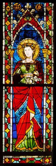
When Margie sent me this picture of a Medieval stained glass window and the color palette she drew from it, I immediately thought about making a woven treasure tassel using transparent glass accent beads along with matte black seed beads. I hoped that, when hung in a window or against a light source, the saturated transparent colors in this tassel would "read" the same way as a stained glass window, and would be appealing in a very similar way.
For some reason, this palette was easier to work with than some of the others. The only difficulty I had was selecting colors that looked rich and saturated both when viewed in ordinary light and when back lit. The yellow tended to look washed out when back lit, and the dark red tended to look almost black when viewed without back lighting. It intrigues me to think that Medieval artists may have had that same consideration, wanting their windows to look spectacular from inside the church with the morning light shining through them, and also wanting them to look good to viewers standing outside the church. I wonder how many colors were available to them? Without professional lighting equipment, I found it difficult to photograph my stained glass tassel in a way that would show both the details in the black beads and, at the same time, the intense colors of the accent beads. But you can probably get the idea of it from this picture. Please visit tomorrow, for the last color palette in this series of posts. |


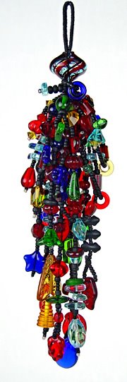


WOW....for some reason this reminds me of Dale Chihuly! I am not sure why.....maybe the glass and pure primary color scheme? Don't know, but I love it!
ReplyDeletethat is GORGEOUS!!!!!
ReplyDeletewhat I don't understand - I guess I will have to wait for the book! - is how to figure out what the color proportions are in your color sample!
Thanks! Glad you like this series.
ReplyDeleteMaybe the tassel reminds you of Chihuly (what a compliment!) because the beads aren't just beads in this application... they are GLASS beads... they couldn't be anything else. So the design and the colors both emphasize the glass.
My understanding of the book is that it will include 100+ inspirational pictures (of paintings, objects in nature, man made things, etc.). Each of the pictures will have a proportional color palette next to it, along with one to three beaded objects made with this palette. In addition 20 of the palettes will include step-by-step instructions for making one of the objects.
I will get back to you, Soren, about how to figure out the color proportions for yourself. I'll ask Margie if she intends to cover this subject. Look for her reply here.
I love the tassle! All the colors are separate yet blended together. I'm like Soren...the proportions are a mystery to me.
ReplyDelete