

One of my lesser known passions is making books by hand. The pages in these two books are all hand-painted papers. I painted the papers and constructed the book in a 2-day (whirlwind) class taught by Albie Smith at Art & Soul in Portland, OR a few years ago.
I'm showing the books because of the fall color palette I used.
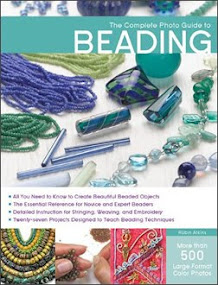
I'm a great fan of Margie Deeb! I love her books about how to find and use many wonderful color combinations, especially her most recent book, shown below.

Forget the color wheel! Margie gives fun and easy to follow color palettes ~ everything from predictable to waaaay out of the box ~ and examples of beadwork (some of which I contributed to this book) showing how specific palettes might be interpreted with beads .
Margie asked me to review her latest Color Report, which explores the possibilities for the ten Pantone colors predicted (check out this fun Pantone link) to be popular this fall and winter, a forecast formulated long ago and used by clothing and assessory designers for fashions released now and into the late fall. You can explore the beady possibilities for this palette of ten great colors with the help of Margie Deeb's latest color report: Fall/Winter 2009 Color Report for Bead & Jewelry Designers, which is available to purchase on line here.
Below are the ten colors. (Color on the internet is always variable depending on your monitor and computer settings. These are approximations of the exact Pantone colors, which are specified by the numbers shown.)
American Beauty, #19-1759, a feel-good color
Purple Heart, #18-3520, refinement and sensuality
Honey Yellow, #16-1143, classic color of autumn
Iron, #18-1306, a grounding color
Burnt Sienna, #17-1544, earth and sunsets
Nomad, #16-1212, bridge between grey and beige
Rapture Rose, #17-1929, vibrant yet soft
Warm Olive, #15-0646, touch of sophistication
Majolica Blue, #19-4125, exotic flair
Crème Brûlée, #13-1106, timeless neutral color
Even me! I'm not much of a fall colors person (except in nature and books). I rarely wear fall colors. However, as I read through the report and looked at all the gorgeous examples, I couldn't help getting really excited about playing with some of these colors. Inspired by Margie's color report, I made my own palette as shown below.

I wouldn't bead this exact design, but will probably stick to the proportions of color. OK! Now I have to go check my beads and fabrics to see what I have in these colors for my next bead embroidery project. Whooohooo, this will be a blast! I'm on my way to my stash right now!
Oh, and YES, I give an A++ to Margie's report. If you want to play with color, it's a grand place to start. Not only for beaders, it will also work well for quilters, painters and anybody using color in their art!


Wondeful Post Robin!!! i need help wtih the whole color thing and it sounds now like I REALLY NEED Margies book and the color report!!!
ReplyDeleteWhat fun!!! I hope that youa re feeling better and that you ahve gottent ot he bottom of your worries of the past several weeks!! Big Hugs!
Elizabeth
Oooooo, great stuff here in this post!!
ReplyDeleteI LOVE these colours to play with, but I'd look totally washed out if I wore them, lol.
Do you use your handmade books once they're completed? Maybe that's a dumb question, but I'm curious if you enjoy them just as they are or if you use them as sketchbooks, scrapbooks, etc?
Great article, Robin. Isn't it funny, but I just wrote one on color for our next Bead Society newsletter.
ReplyDeleteHope this finds you feeling better. You are often in my thoughts.
Oh boy - another Margie Deeb book. I have "A Beaders Guide to Color" and now I want to run out and get this new one. Can't wait! I love the colors you've put together here and will be waiting to see how you use them.
ReplyDeleteInteresting, there was a lot of that "honey Yellow" on the Emmy carpet this year. I thought it was just fleshy!
ReplyDeleteGreat post, Robin! I am a fall color girl all year-round -- just happen to love earthy colors, I guess.
ReplyDeleteI'm afraid this particular pallette just wouldn't work for me because purple and yellow are two colors I can never wear. However, I can visualize working up a design or two in them . . .
Kathy V in NM (who loves that book by Margie, too!)
My question is, do you often follow the colors that are supposed to be in fashion this season? I find I only do if I happen to like them but then sometimes, the liking sneaks up on me like the color orange lately. It's not usually a color I like but maybe because I am seeing so much of it I find I am using some too. I hate being in thrall to the fashion experts though.
ReplyDeleteI found your new post when I checked in to Facebook. That works really well!
Color seems to be my weakest area. I'm not color-blind, I just don't have a good knack for arranging them in a pleasing fashion. I shall check into this further, and hopefully come away not being so intimidated by color choices. Your palette would have been impossible for me to arrange, but it's lovely!
ReplyDeleteOhhhhh! I love this post Robin and I love the new fall colors palette too! Thanks so much for that link! I really want to go to Art & Soul one of these years - even to the point of thinking I might choose that love Houston even!
ReplyDeleteIf you go to the social in October I'll bring all of those Artful Bloggers for you
I saw the Pantone color report a few days ago and I really love those colors. I am not usually a big fan of fall colors, either, but these are really different from the usual pumpkin-orange/harvest-gold/chocolate-brown fall palette. I have Margie's book already but I will have to go take a look at her take on the report!
ReplyDelete