

Do any of you remember back in the ‘60s when it became very popular to analyze your hair, skin and eye color to determine which season you were, and therefore which colors you should wear in order to look your best? I don’t remember what the system or book was called, but I remember clearly how it changed the look of my closet forever.
As a youngster, my Mom thought brown and aqua were good colors for me. I loved pink, and would beg her to buy pink anything… sweaters, blouses, and socks for sure. She let me wear pink sometimes, but always in combination with brown slacks, brown skirts, brown coats. Brown for fall and winter; aqua for spring and summer… with as much pink as I could get her to buy. In home economics class (which I loathed, because I really wanted to take mechanical drawing, which wasn’t available to girls), I remember making a brown corduroy princess-style jumper. Although I was quite proud of myself as a seamstress, I never wanted to wear it.
From the seasons system, I finally understood why not. I am a winter. Brown is an autumn color; aqua is a spring color. Autumn and spring are the warm undertoned colors; whereas summer and winter colors are cooler and more saturated. No wonder I never liked how I looked! Gradually, I began to shift my wardrobe colors to reds, blues, purples, grays, and black. No more brown on this body! When I went away to college, my first purchase was a RED bedspread and BLACK pillow with WHITE polka dots. Whooopppeeeee! No more living spaces decorated in gold, avocado and brown for this kid… never again!!!!

Hello! I’m back to writing about color! This post is actually about YELLOW! I don’t remember yellow being one of the approved winter colors. I never considered buying anything yellow, possibly because it was too close to brown in my mind. And I never used a single yellow bead until three years into my beading career.
At that point I started working on a piece of bead embroidery, which has remained unfinished for more than 15 years. It was the start of my In Case of Fire bag.
It all started when I took a class about creativity. Suzanne Kjelland, the instructor, posed this question: “If there were a fire in your home, and all the people and pets had gotten out, and you had one last safe trip into the house, what would you bring out?” The more I thought about that question, the harder it was to decide. My sewing machine? The quilt I made for my bed? My beads? My childhood books? A painting by my brother? The question kept me awake far into the early morning hours. I kept thinking about precious little things people had given or made for me, such as a cassette of Winnie-the-Pooh stories read by my Dad, a broken guitar string from a friend’s concert, a picture from a camping trip, etc. I didn’t even know where to find some of the things.
Over the next few days I found all of these special mementos and put them in a box, ready for rescue in case of fire. I decided it would be nicer to keep them in a lovely beaded bag, and set about immediately to make one. Well! As I beaded, it was so much fun to think about friends and family and the precious memories inspired by their gifts, that I eventually decided to make a bag for EACH ITEM. That’s why I’m not yet finished with the In Case of Fire bag, which will eventually hold all of the items in their individual beaded bags. I keep adding more items and making more individual bags… so I still don’t know how large to make it.
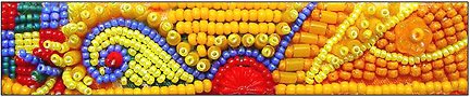
My plan is to make the bag eventually, and appliqué the piece shown below, which I embroidered way back then, onto it.

This was the first time I’d ever used a yellow bead in anything. You can see what a tentative and sparing use it was. Yet, inspired by the fabric print on which I was beading (swatch shown below), I just had to do it.

And, I liked it! Yellow beads began creeping into my work… more of them and more often. Orange too. As Margie Deeb says in this month’s Muse (about the color yellow), “In its full saturation, this most luminous color radiates and dazzles. Exuberantly cheerful, yellow uplifts our spirits, helps us gather self-confidence, and stimulates our mind to focus and think more clearly (a yellow legal pad keeps you more alert than white paper, though it may affect you more like a caffeine buzz).”
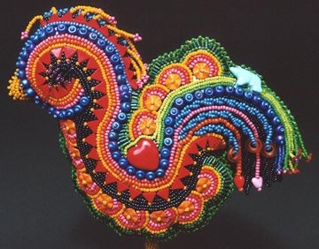
This is certainly true of the yellow beads in my sculptural piece, Rosie, The Uncaged Hen.
And, here is a piece I made to inset into the cover of one of my books.
Now, after recently completing the Penguin Pin, based on the color scheme of the Emperor Penguin, I’m even more interested to see what I can do with yellow beads. I’m thinking about a deeply violet wild flower that booms briefly in the spring around here. It has the most intensely saturated yellow stamen and lovely grayed-green foliage. I think it will be an awesome color scheme. To experiment with it, I’ll make a couple of beaded buttons featuring different hues and proportions of yellow beads.
A friend once gave me a copy of part of a Doctoral Thesis entitled Universal Psychological Color Associations. According to this study, yellow is the favorite color of children, and the least favorite of adults. Not surprisingly, blue is the reverse… the least favorite of children and top pick of adults. Ever since reading this, I’ve thought that working with yellow beads must be a treat for the child within me. And, indeed, I find myself delighted in a happy, carefree, childish way, whenever I add yellow paint or beads to my work.
If you Google psychology of color associations, you’ll find some very interesting articles. Here is one I particularly like, especially the picture of the warm-to-cool room!
Questions for the day:
- What things or experiences do you associate with the color yellow?
- Which shades or tints of yellow appeal to you the most, and why?
- How do you feel about using yellow in your art work? How might you take yellow to the next step, beyond what you’ve already done with it?
- What if there were a fire in your home, and all the people and pets were out, what would you save on your last safe trip into the house?


Some interesting questions here but I only have time for 3 -
ReplyDeleteWhat things or experiences do you associate with the color yellow?
My first encounter with Van Gogh's sunflowers in the flesh - I was visiting London and had set up a meeting with friend in the gallery came hurtling around the corner because I was late and they hit me-
Which shades or tints of yellow appeal to you the most, and why?
softer wheat like yellows - they remind me of my childhood and the wheat belt in western australia
What if there were a fire in your home, and all the people and pets were out, what would you save on your last safe trip into the house?
I have been in this situation when the whole suburb was on fire in the Canberra fires - after grabbing quilts, family photos, sketchbooks and journals - I grabbed a tooth brush and clean undies - threw themall in the back of the car and then went back to fight the fire - we did not lose our home but 5 houses in a street of 18 went up - fire yellow is not my favourite
I associate yellow with sunshine, warmth, cheerfulness but it isn't a color I use often and I don't wear it.
ReplyDeleteI think lemon yellow or buttery yellow are pleasing. I don't like intense orangey yellows.
Recently I have begun to use yellow a bit more in my home. I painted our guest room a soft yellow and I used a yellow gold in our family room. Everyone tells me it is warm and inviting. I still don't use yellow much in any kind of craft or artwork.
The things I would grab would be photos and family mementoes.
1. Sun, summer, and warmth
ReplyDelete2. Dark yellows because they're warmer.
3. I'll use yellow when its called for, but I've never set out to make something that was specifically yellow.
4. I might make something yellow that is traditionally a different color.
5.My grandmother's diamond dinner ring. She had it made from the diamonds of her wedding and engagement rings after my grandfather passed away.
1. Summer, sunflowers, black-eyed susans, the sun, warmth. Most recently a lampworked bead that I bought on a whim. It's a donut with little nobbies and a swirl of clear, yellow and orange. It just kept looking so darn happy among the more "adult" beads in the bowl.
ReplyDelete2. I've recently started to enjoy yellow. I normally avoided it but I'm finding more and more ways to use it to punch up my beadwork. Lemon meringue pie yellow, sunny yellow, and to a lesser degree a mustard yellow are all wonderful colors. Yellow is, when not used to excess, very happy. Too much though can hurt your eyes and turn you off of a thing.
3. Rather than use it as an accent color, use it as the main color. Trust me, that's going to be a challenge for me.
4. Easy, my wedding album.
Yellow is the color of kitchens when everyone knows the best kitchens to work in are blue and white.
ReplyDeleteCreamy yellow or fresh churnned butter yellow is fine. Touches of a deeper more vibrant yellow with purple are good. Having grown up on the Great Plains I like golden yellows of wheat rippling in the wind.
I used reds, yellows, oranges and in all shades and tones in a piece that is called "The Wind and Flames of the Holy Spirit." It is a bead embroidered sculptured piece with just those colors. I tend to use red in monotones renderings or blue, but not too much yellow. I have a friend who does a lot of yellow and purple together and I wonder how she does it so well. She handles it just right. I tend to go overboard with yellow when I'm not making fire in my work, so I really admire her use of those two compliments together.
In a fire, well, I'd grab papers and underwear and toothbrushes and chocolate. I'm just about the most practical person in the world and so non-sentimental you'd never guess I have an artistic bone in my body.
Sunshine, heat, skin cancer.
ReplyDeleteDetermining the temperature of heated metal. Yellow iron is nicely malleable
A fire in my home would be welcome to all the junk, the garbage I've built,the "art", all the detritus I've collected that "might be useful someday" I would just hope that I didn't look too happy when the fire department showed up.
The yellow of the flames, along with the reds, the oranges, and even the greens and blues would make a nice show and at least that would bring some meaning or profit to it all.
I've been asking myself that last question ever since I first read about the fire question in One Bead at a Time...for sure the family photos and a few important papers like birth certificates and marriage license...then the vintage beads, then friends' artwork...
ReplyDeleteyellow has always been a favorite color but until recently I haven't used it often in my artwork...probably because there isn't a huge amount of yellow in the pac. NW...lots of greens and blues...not so many reds or yellows.
I love yellow and have had it on walls in many houses, in my wardrobe and in my work for years. I am not fond of gold (the color) at all and am just now letting it come into contact with anything of mine!
ReplyDeleteOoooooh! Thanks to all for the yummy color associations. Seems like a number of us are just beginning to explore yellow in our work.
ReplyDeleteTeantae ~ I admire you for setting forth such a huge challenge to yourself, and hope to see the results. Maybe you can start with that happy, nobbie yellow and orange lampwork bead, and build a piece from there?
The fire question gave intersting results too... some of those things never crossed my mind that sleepless night years ago ~ like birth certificates, family heirlooms, or my favorite poetry books.
Sharonb ~ it was chilling to read of your experience in the Canberra fires. I didn't expect anyone to respond who had actually had this happen (or nearly)... your comment gave me an indication of the real importance of this question. I'm glad your home was among those which escaped the flames.
Heron ~ Thanks for mentioning that yellow is anti-depression. How true!
Mary ~ If you email me a picture of the "Wind and Flames..." piece, I'll include it in my next post.
To all ~ I'm really surprised that nobody commented about the color system or mentioned their experiences with it. Are you all too young? I'm also surprised at how many of you responded to the questions at the end of the post... It's fun to think of them, and gratifying that you've used them to shape your comments. Thanks so much!
Yellow reminds me of a pair of pj’s I had as a child, pale yellow with tiny white dots. I remember wearing them and sitting on the curb in front of my grandma’s house, warm in the sun and feeling safe and happy, and loving the long lazy day stretching ahead of me.
ReplyDeleteI love all yellows except lemon yellow and neon yellow. My favorites are pale baby yellow, barely there, and golden sunflower yellow.
I’ve never used a lot of yellow in artwork, although I’m not afraid to use it. I tend to hoard those sweet yellows I love. It might be fun to think about doing a piece and making everything yellow in it. Especially if the subject was eggplants or sausages or canoes or all the above.
If there was a fire, I think I’d stay outside with my doggies. I’ve lived without most of my stuff twice in my life and I’ve always found it to be really liberating. That gives me great incentive to clear out some clutter!
Yes, I remember that color system from the early 80's. One of my friends had a color party where everyone was given their "season" using big drapes of fabric. I am a spring and still have my little folio of cloth swatches! At the time, it did shift my color choices for clothing and they've become ingrained now. But I don't see that my artwork follows those same preferences. That's interesting.
ReplyDeleteYellow for me is warm spring sun, & daffodils springing from the white & browns of winter. I'm always drawn to it in Feb & March for obvious reasons. I love using it next to oranges & fushia, to make my work warm & on fire.
ReplyDeleteI'm not sure where I'd take it from here. I've got so many things I want to do, I'm not going to worry about one color.
What will I save after My DH & cat? That's a tough one. Things made by my children's hands. My own work would secondary. I could always make it again only better!
OMG these pieces are beautiful! I have a thing for birds......so....that is my favorite! But all are so beautiful it is really hard to choose! Love your work......Thanks for sharing. Linda
ReplyDeleteAhha! Got it! I think the color system/book might have been Color Me Beautiful! by Carole Jackson. It seems to have been reprinted and republished several times, with the latest update still available new in bookstores. I haven't been able to figure out when it was originally published. The earliest edition I found was 1973, but I think I recall using it earlier than that.
ReplyDeleteNew Zealand poet, Sam Hunt, wrote about Yellow as follows:
ReplyDeleteIt is the yellow of
(guessed it) the
dandelion:
bees have
died for it, mis-
taking the sun.
That's how one
sucj story goes.
Yellow as that.
Probably
true, the story.
Any
story about
dandelions and yellow
has got to be.
For you,
remember it. Be
ready to die for it.
Yellow as that.